
14 Critical User Interface Design Mistakes You Must Avoid
 By Waltz Staff
TL;DR:
Avoiding UI design mistakes is key to enhancing user experience and accessibility. This blog identifies 14 common errors that can damage trust and usability—especially confusing navigation (which disrupts user flow) and inconsistent styling (which undermines brand credibility). A polished, user-first design approach with clear visual hierarchies and consistent styling ensures smooth, engaging interactions across devices and audiences.
- Confusing navigation disrupts user flow.
- Neglecting design details weakens visual coherence.
- Lack of visual and text hierarchies confuses users.
- Inconsistent logos and buttons undermine brand trust.
In the symbiotic relationship between UI and UX design, UI is the partner that selects a website’s elements. Text, logos, buttons and the use of branding are all the responsibilities of UI designers. These user interface elements are the foundation of any website.
The user’s journey across the elements, however, belongs to UX. These two work hand in hand to ease a user through interactions with elements on the site. Both require the human touch to guide the user through a certain path.
When designing a user interface, the details make the site. The minutiae of UI elements are what turns hours of interaction design into a seamless journey. Whether or not they know it, users expect consistency, clear navigation and high-quality images.
Avoiding the following common mistakes will boost your users’ satisfaction. This is true regardless of what type of user interface you’re designing. Continue reading to learn about how you can avoid these UI pitfalls.
14 UI Design Mistakes That Undermine User Experience
The little things make a large difference in website design. Visual elements like the site’s color palette and font sizes aren’t just the cherries on top of the sundae. Instead, they’re the foundational steps toward guiding users where you need them to go. User interface design is crucial for ensuring that your digital products are accessible to your audience.
Here are common UI missteps that can make or break a website.
1. Confusing navigation
Websites exist to guide users toward a desired action. This may be signing up for a mailing list, purchasing a product or following a social media page. When users can’t find the next step on their path, the entire choreography falls apart.
2. Forgetting the details
Again, the little things are the most important. Every choice matters, from hover effects to how you use accent colors.
3. Lack of hierarchies
Information and text hierarchies are essential in guiding users and communicating with them. You should prioritize legibility and organization when editing text sections on your site. Text with the correct formatting, contrast and clear visual separation ensures that visitors read the most important text first.
4. Logo & button inconsistencies
Consistency is a crucial element of user interface design. Because of its importance, we’ll go further in depth on this topic later. Keeping components and elements stylistically similar or identical builds trust with visitors to your site.
5. Low contrast
Following the principles of universal design makes websites accessible to a greater percentage of the population. High contrast websites are the most readable for those with vision problems. Other Web Content Accessibility Guidelines (WCAG) include:
- Providing alt text for multimedia
- Designing sites that work with assistive devices
- Using clear and concise language for necessary information
- Designing sites for keyboard accessibility
6. Not putting the user first
Trendy and exciting UI/UX design elements are fun to work with. However, users depend on familiarity for web navigation. Prioritize user needs over trendy design elements that might look impressive but confuse your audience.
7. Poor alignment
Alignment is non-negotiable when building any site. It polishes the product, making text significantly easier to read. For balanced, beautiful websites, your alignment and kerning should be sharp.
8. Poor quality images
High-resolution images build trust with visitors and reinforce your brand's professional quality. Whether you're showcasing products, team photos, or brand graphics, maintain consistent visual standards across all multimedia elements to create a cohesive user experience.
9. Poor touch targets
Mobile users need intuitive, accessible touch targets to navigate your site effectively. Design buttons, links and interactive elements to be at least 45 pixels in size - large enough for fingers to tap accurately without frustration. Well-sized touch targets ensure users can complete your desired actions smoothly, whether that's making a purchase, signing up for a newsletter, or contacting your team.
10. Poor use of negative space
Negative space - the empty areas around your design elements - is a non-negotiable aspect of effective user interface design. Use negative space strategically to create clean, focused layouts that guide users naturally through your content and prevent visual overwhelm.
11. Too much text
Text is the best way to communicate important information. Keep it concise so vital facts stand out clearly to your users.
12. Visual busyness
Websites can have rich, complex designs without being chaotic. The key is organizing visual elements thoughtfully to guide users rather than overwhelm them.
13. Wrong colors
Your site’s colors should be correct for their context. Color has a significant impact on psychology and therefore is a tool you should use with intention.
14. Poor use of accent colors
Your site’s accent colors are part of your brand story. Accents should complement one another, appeal to your target demographic and be used sparingly.
Avoiding UI Inconsistencies
We’ve been saving the most common interface error for a final deep dive: user interface inconsistencies. Design consistency is one of the easiest things to get wrong—and one of the most annoying for users to wrestle with.
All repeatable actions and elements on a site should be consistent. This includes styles, line thickness and corner radius. Alignment, kerning and spacing should also be consistent across the site. The more clarity and consistency for users, the better.
Your style guide should come first, leading to a library of components and elements for your digital footprint. Once you select colors, effects, phrasing and typography for your website, creating consistency across UI elements is simple. This will make your website intuitive, user-friendly and easy to navigate.
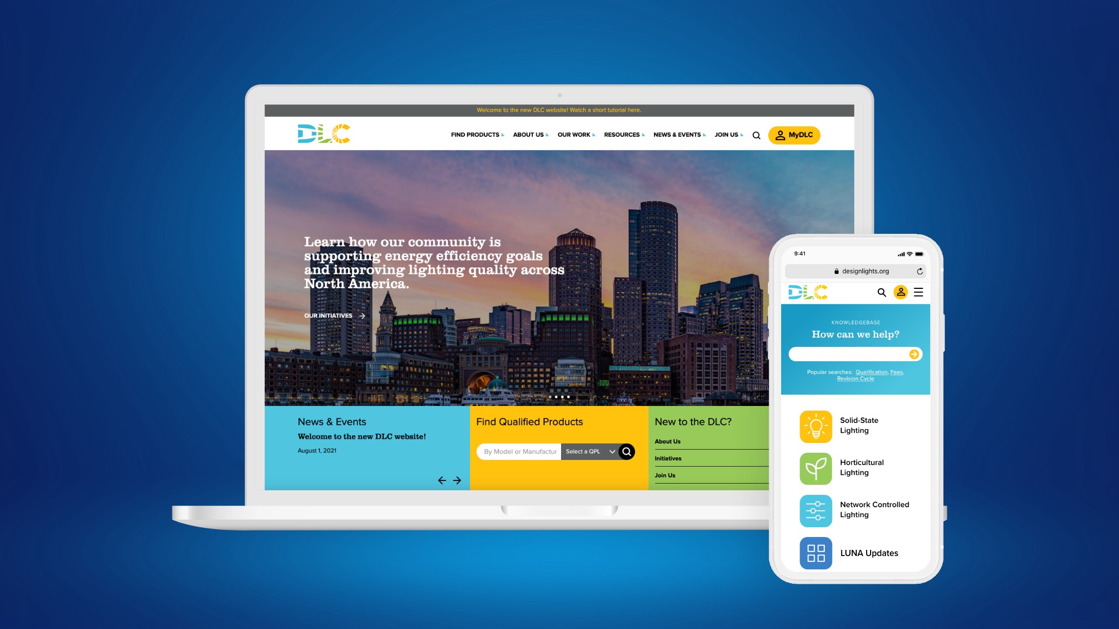
See how we applied these UI consistency principles when designing a new website for the Design Lights Consortium
Balancing Form and Function in User Interface Design
The information architecture behind websites means so much more than just aesthetic appeal. Our UI team works to find the right blend of function and form for our partners’ websites. Our goal is to make sure your brand resonates with the user, and that they find your site easy and enjoyable to interact with. We use WCAG best practices to ensure your site is accessible to everyone.
We round out this phase of web design with functioning mockups to simulate user interactions (UI). We also mockup responsive designs that work between mobile and desktop. Waltz is here to ensure a smooth experience from start to finish.
As a full-service marketing and creative agency, we’re experts at shining the spotlight on our partners. We’re proud to serve the businesses and nonprofits who trust us to take the lead.